
Financial charts often fail to communicate price action clearly when candlestick shadows appear excessively thick. This technical guide explains the matplotlib candlestick wick thickness problem and demonstrates precise methods to control candle shadows using Matplotlib primitives. The article focuses on rendering accuracy, pixel scaling, and plotting internals so that price charts remain readable, professional, and suitable for analytical or trading applications.
Table of Contents
- Candlestick Wick Rendering Basics
- How Matplotlib Draws Line Objects
- Difference Between Candle Body and Wick
- Pixel Scaling and DPI Effects
- Limitations of Default Candlestick Helpers
- Root Cause of Thick Candle Shadows
- Linewidth Defaults in Matplotlib
- Figure Size and Aspect Ratio Mismatch
- High-Resolution Export Side Effects
- Backend Rendering Variations
- Manual Candlestick Plotting for Precision
- Basic Candlestick Wick Drawing
- Dynamic Linewidth Scaling
- Separating Body and Wick Styling
- Using Line Collections for Performance
- Comparison of Wick Rendering Techniques
- Best Practices for Professional Candlestick Charts
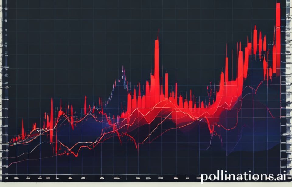
Candlestick charts are a core visualization tool in technical analysis, yet small rendering details can significantly affect interpretability.
One of the most common issues reported by developers is unusually thick candlestick wicks that distort market structure and mislead visual analysis.
Candlestick Wick Rendering Basics
Understanding how candlestick wicks are rendered requires familiarity with Matplotlib’s drawing primitives.
Wicks are not abstract financial objects but simple vertical line segments drawn on a canvas.
How Matplotlib Draws Line Objects
Matplotlib renders candlestick wicks using line-based artists, typically Line2D objects.
The perceived thickness of these lines depends on both the linewidth parameter and figure DPI.
Higher DPI values can amplify visual thickness if linewidth is not scaled accordingly.
This interaction is the root cause behind unexpectedly bold shadows in financial plots.
Difference Between Candle Body and Wick
The candle body is usually drawn as a rectangle patch, not a line.
Rectangles scale differently than lines when figure dimensions change.
This mismatch creates visual imbalance when default parameters are used.
Explicit control of both elements is necessary for professional output.
Pixel Scaling and DPI Effects
Matplotlib computes linewidth in points, not data units.
When DPI increases, points translate to more pixels on screen.
This can make wicks appear disproportionately thick.
Adjusting linewidth relative to DPI resolves this issue.
Limitations of Default Candlestick Helpers
Helper functions such as mplfinance or legacy candlestick utilities use fixed defaults.
These defaults may not suit high-resolution or embedded plots.
Relying on defaults limits fine-grained visual control.
Manual plotting offers superior precision.
Root Cause of Thick Candle Shadows
Before applying fixes, the underlying cause must be clearly identified.
Most wick thickness issues stem from implicit scaling rather than bugs.
Linewidth Defaults in Matplotlib
The default linewidth value is optimized for general plotting.
Financial charts require thinner, more delicate strokes.
Using defaults leads to exaggerated visual emphasis.
Explicit linewidth specification is mandatory.
Figure Size and Aspect Ratio Mismatch
Wide figures with compressed y-axes exaggerate vertical strokes.
This makes wicks dominate candle bodies visually.
Aspect ratio adjustments reduce distortion.
Balanced geometry improves clarity.
High-Resolution Export Side Effects
Exporting charts at 300 DPI or higher magnifies stroke widths.
This is common when generating reports or PDFs.
Without compensating linewidth reduction, wicks appear bloated.
Resolution-aware styling is essential.
Backend Rendering Variations
Different Matplotlib backends render strokes slightly differently.
SVG, PNG, and Agg backends may show variance.
Testing across formats avoids surprises.
Consistency requires explicit styling.
Manual Candlestick Plotting for Precision
Manual plotting provides full control over candlestick appearance.
This approach avoids the constraints of helper abstractions.
Basic Candlestick Wick Drawing
import matplotlib.pyplot as plt

fig, ax = plt.subplots()

ax.vlines(x=1, ymin=100, ymax=110, linewidth=0.5, color="black")

plt.show()
This code draws a single wick using vlines.
The linewidth parameter directly controls shadow thickness.
Values below 1.0 are recommended for financial charts.
This method bypasses default candlestick helpers.
Dynamic Linewidth Scaling
dpi = plt.rcParams["figure.dpi"]
wick_width = 0.5 * (72 / dpi)

ax.vlines(x=1, ymin=100, ymax=110, linewidth=wick_width)
This approach normalizes linewidth against DPI.
It ensures consistent visual thickness across exports.
The formula converts points to pixels.
This technique is critical for publication-quality charts.
Separating Body and Wick Styling
Wicks and bodies should never share style parameters.
Rectangles require width-based sizing, not linewidth.
Decoupling styles prevents visual imbalance.
This separation is a best practice.
Using Line Collections for Performance
Large datasets benefit from LineCollection.
It allows batch rendering with uniform styling.
Performance improves significantly.
Visual consistency is maintained.
Comparison of Wick Rendering Techniques
| Method | Control | Use Case |
|---|---|---|
| Default Helpers | Low | Quick Prototypes |
| Manual vlines | High | Professional Charts |
Best Practices for Professional Candlestick Charts
Consistent styling ensures readability across platforms.
Minor adjustments greatly enhance analytical value.
Recommended Linewidth Values
Values between 0.3 and 0.6 work well.
Exact values depend on DPI and figure size.
Testing is essential.
Never rely on defaults.
Export Format Testing
Always test PNG, SVG, and PDF outputs.
Each backend renders strokes differently.
Adjust styles per target medium.
This avoids surprises.
Consistent Theme Usage
Use a unified color and stroke theme.
This improves cognitive parsing.
Consistency builds trust in charts.
Professionalism is enhanced.
Automation for Reproducibility
Encapsulate styling in reusable functions.
This ensures repeatability.
It also simplifies maintenance.
Automation is critical in analytics pipelines.
Also Read
From our network :
- Bitcoin price analysis: Market signals after a muted weekend
- How to secure postgres connections across VPC, VPN, and cloud
- How to migrate to postgres using logical replication and cutover
- Limit Superior and Inferior
- JD Vance Charlie Kirk: Tribute and Political Strategy
- The Diverse Types of Convergence in Mathematics
- How to design postgres partitions with native and hash methods
- Bitcoin Hits $100K: Crypto News Digest
- Limits: The Squeeze Theorem Explained
RESOURCES
- No results found.